MERIDIAN
BRAND GUIDELINES
Tone of Voice
We have three guiding tone of voice principles that help bring Lumin to life.Rooted in the Sage archetype, our voice is built to illuminate — not to impress. Every word we write should make someone feel smarter, not smaller.
Voice Pillar One
Clear
We turn the black box into an open system. Every insight we surface must be traceable, legible, and immediately useful — no abstraction left unexplained.
Voice Pillar Two
Precise
Accuracy is table stakes. What separates Meridian is that every number lands with context — what it means, why it shifted, what to do with it.
Voice Pillar Three
Decisive (not prescriptive)
We name the next move. Not as a suggestion buried in a paragraph — as a clear output, ranked by impact, ready to act on today.
Logo
The Meridian logo is a visual symbol of our mission, values, and commitment to empowering creatives and technologists. It represents clarity, efficiency, and innovation.
Clear Space
To look its best, our logo needs space to stand out. We have defined parameters to make sure no ot her elements encroach on t his clear space.
Clearspace
Logomark
Our logomark is a distinct, standalone icon that captures the essence of Meridian. It is designed for flexibility, allowing seamless use across various applications, from digital interfaces to physical branding.
Incorrect Usage
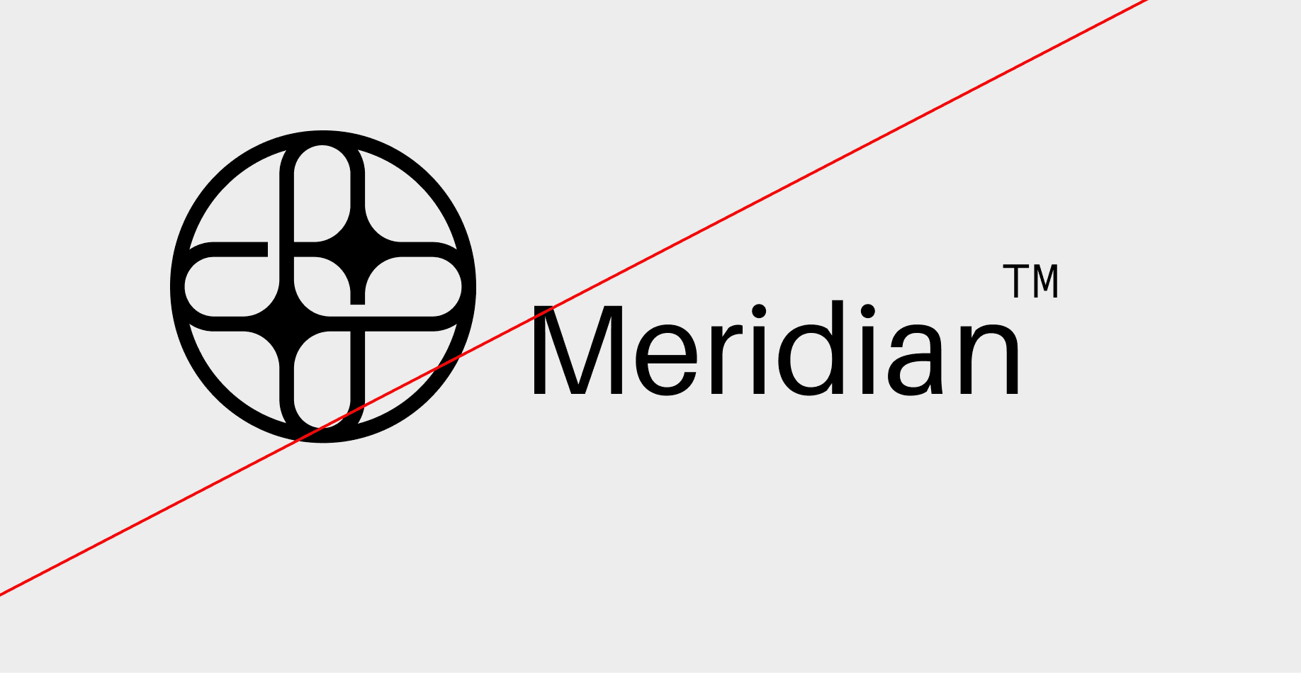
Do not resize the mark
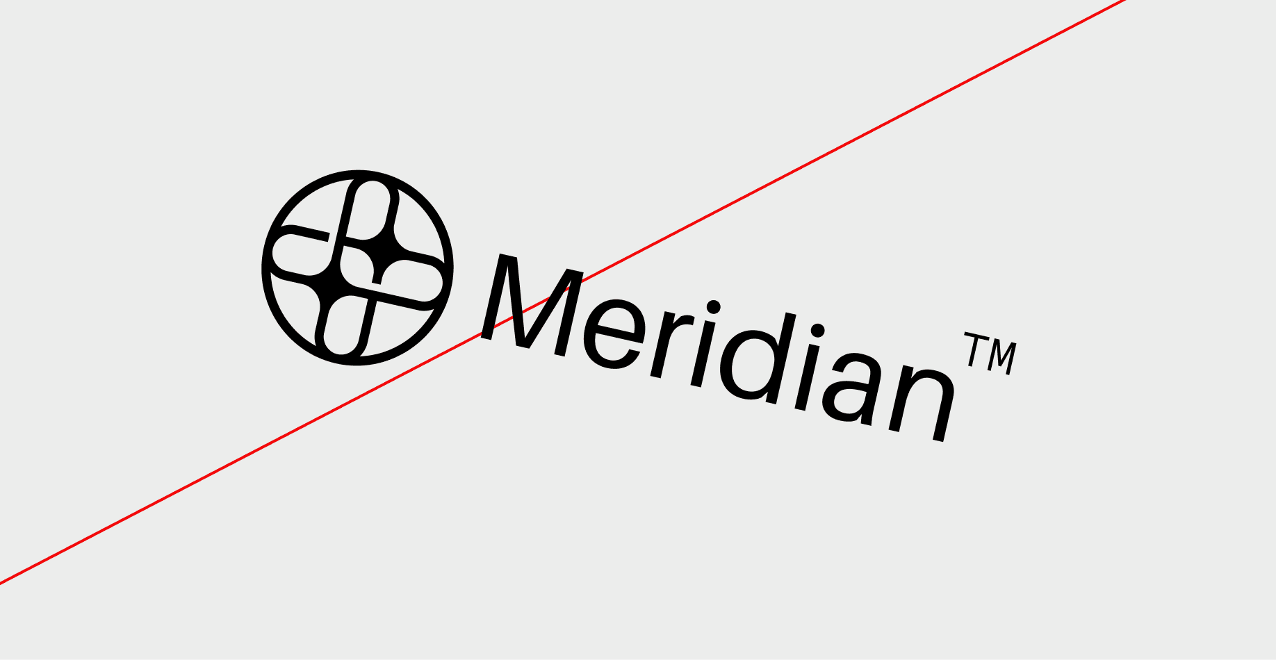
Do not rotate the logo
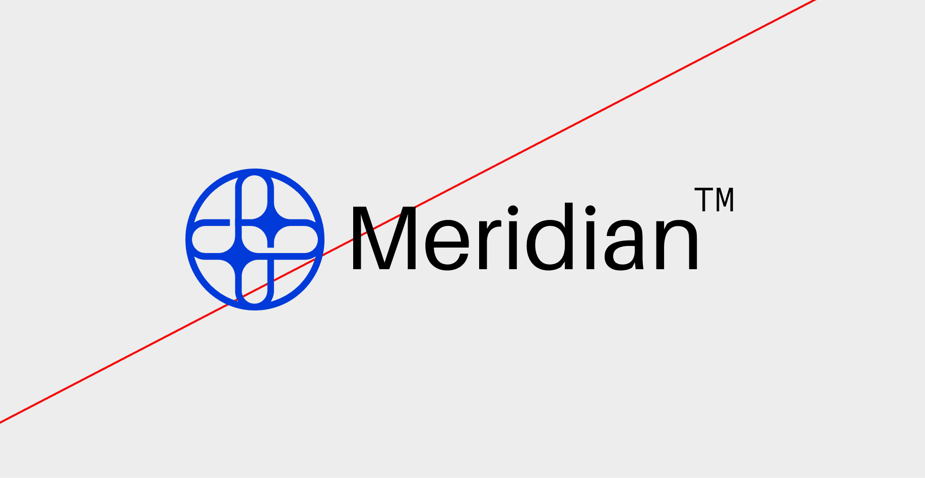
Do not change the color of the mark alone
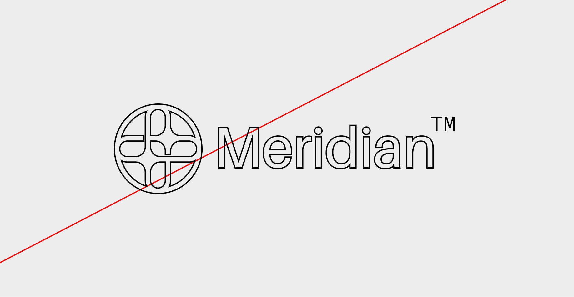
Do not outline the logo
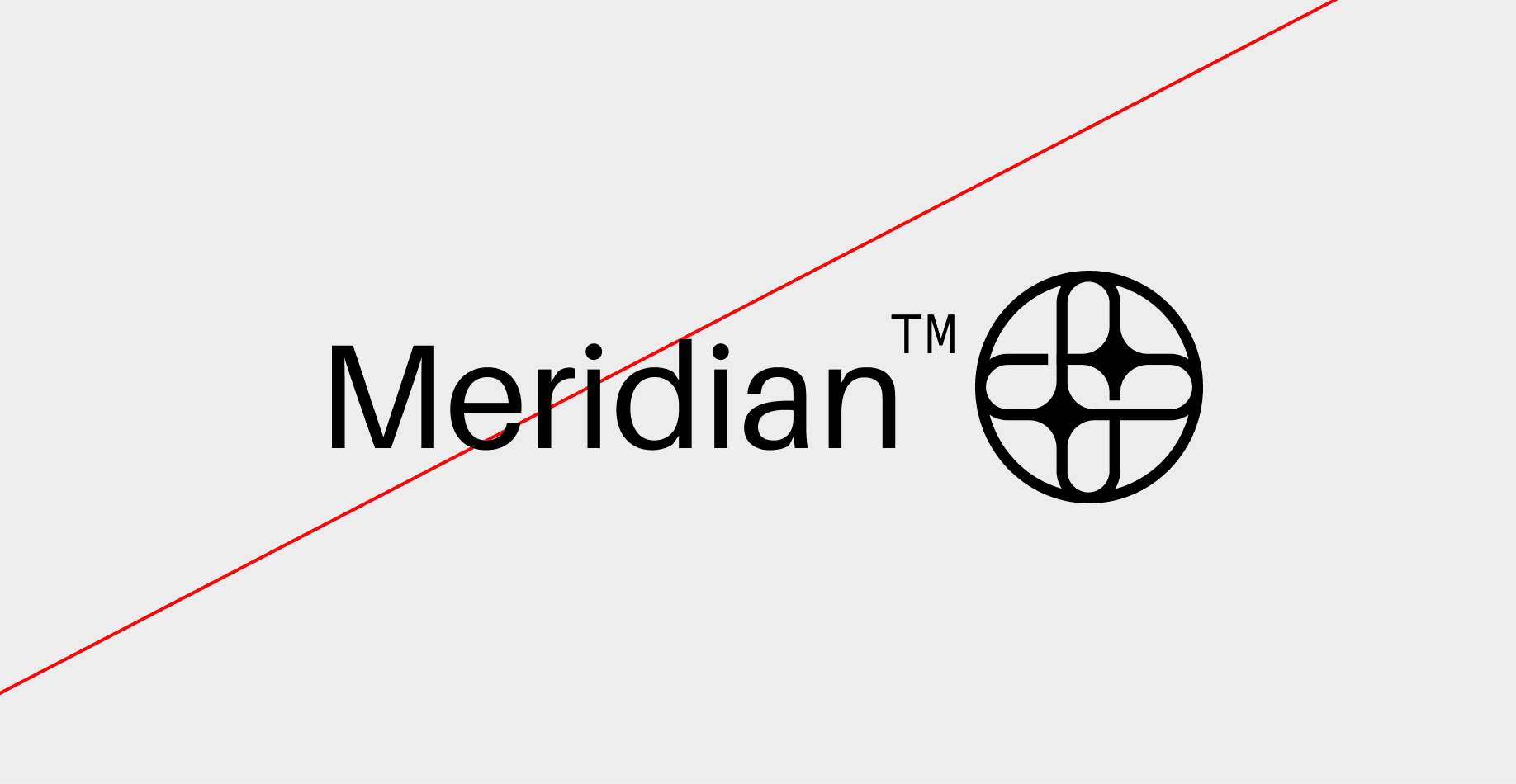
Do not reverse the lockup
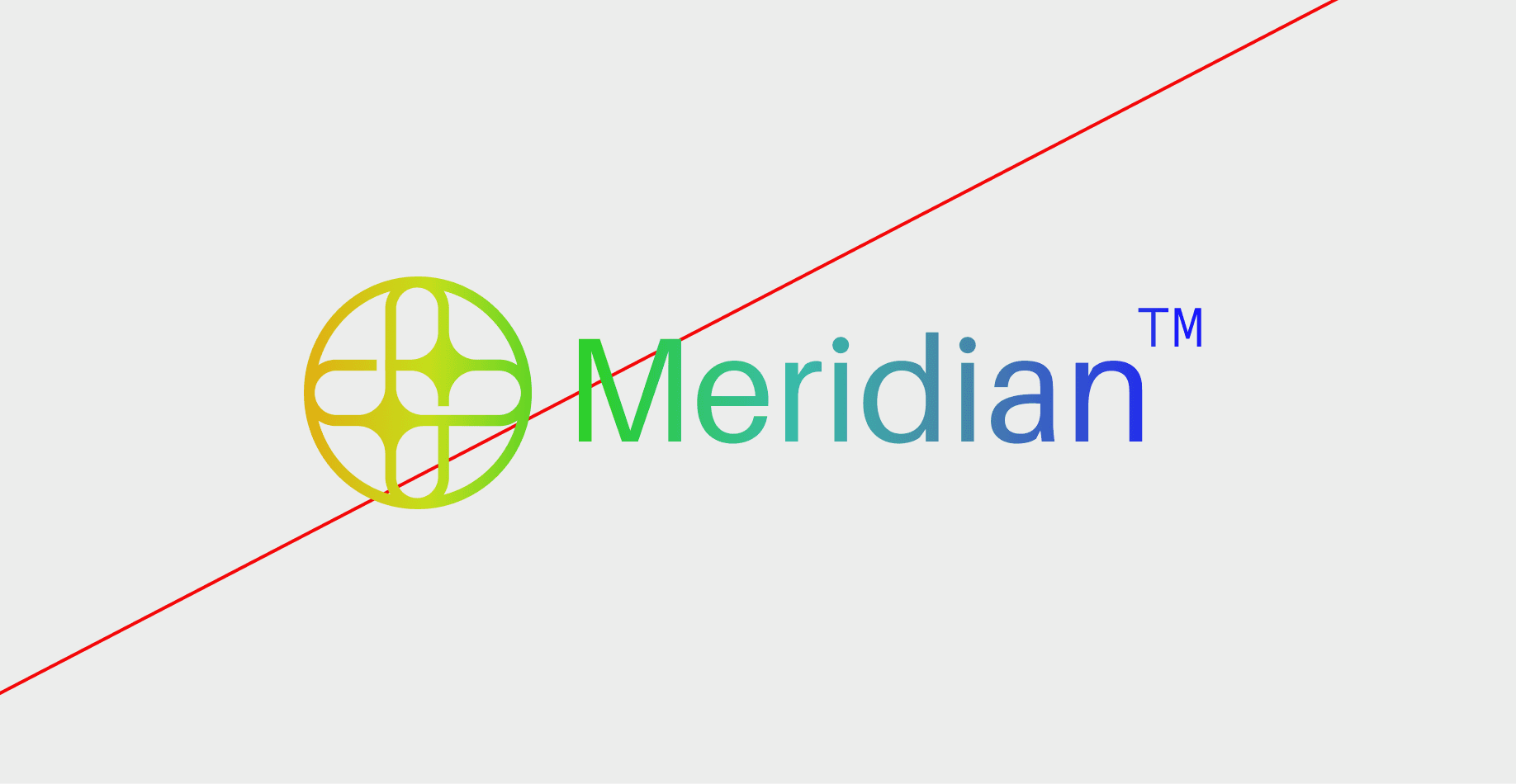
Do not add gradients the logo
Core Color Palette
The core colors define Meridian's visual identity, reflecting our innovative and modern approach. These colors are used consistently across all brand materials to maintain recognition and cohesion.
HEX #000000
R 0
G 0
B 0
HEX #EFEFEF
R 239
G 239
B 239
HEX #3A3A3A
R 58
G 58
B 58
HEX #C6CACF
R 198
G 202
B 207
HEX #858585
R 133
G 133
B 133
Sencondary Color Palette
Our secondary colors complement the core palette, adding versatility to our design system. These colors appear in UI elements, illustrations, and marketing materials to differentiate content and enhance user experience.
HEX #BDEFFB
HEX #7BCEEF
HEX #43B9E8
HEX #1096CB
HEX #DBFD9F
HEX #CBF96D
HEX #A8F516
HEX #88C810
HEX #FEC466
HEX #FFB134
HEX #FF9C08
HEX #E68D01
HEX #E78793
HEX #DF5E6C
HEX #D83547
HEX #AB2937
Family of Typefaces
Your typography system is built to reflect clarity, precision, and a modern digital aesthetic. By combining Aileron and Sometype Mono, the brand achieves a balance between contemporary sophistication and technical character, creating a cohesive and recognizable visual identity.
Aileron – Our primary typeface, designed with a clean geometric structure and modern versatility. It delivers a confident, refined presence while maintaining excellent readability across both print and digital applications. Aileron represents innovation, simplicity, and forward-thinking design.
Sometype Mono – Our secondary typeface, chosen to complement Aileron with a technical and minimalist tone. Its monospaced structure introduces rhythm, precision, and functionality, making it ideal for captions, interface elements, labels, and supporting content.
Aileron
abcdefghijklmnopqrstuvwxyz
ABCDEFGHIJKLMNOPQRSTUVWXYZ
1234567890!@#$%^&*
Sometype mono
abcdefghijklmnopqrstuvwxyz
ABCDEFGHIJKLMNOPQRSTUVWXYZ
1234567890!@#$%^&*
Type Hierarchy
Meridian's typography follows a structured hierarchy to maintain clarity and readability. Headlines, subheadings, and body text are carefully sized and spaced to guide the reader through the content seamlessly. This hierarchy ensures a balanced flow and strong visual impact.
Label
Sometype mono, Regular
Powering Creativity
HEADING
Aileron, Semi-Bold
Powering Creativity
SUB-HEADING
Aileron, Semi-Bold
Powering Creativity
BODY TEXT
Aileron, Regular
Unilox streamlines your creative process, automates repetitive tasks, and helps you focus on what truly matters—bringing ideas to life.
Icon Library
Photography Direction
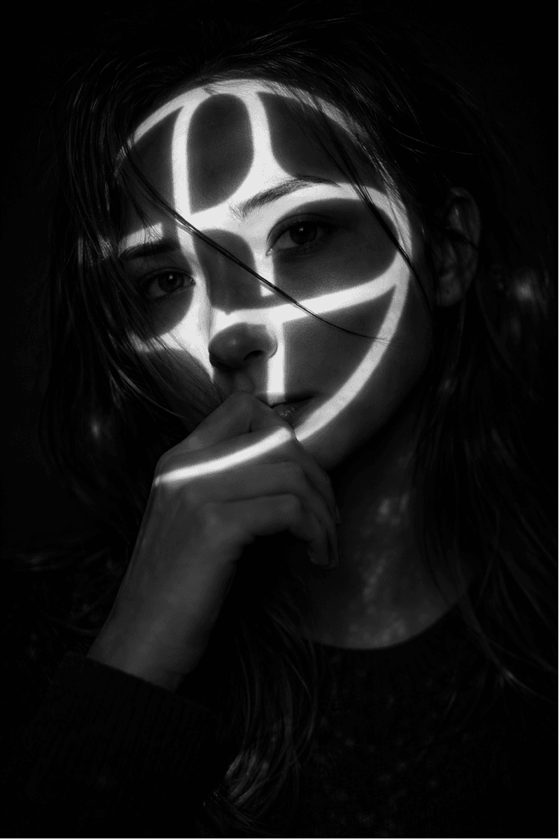
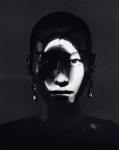
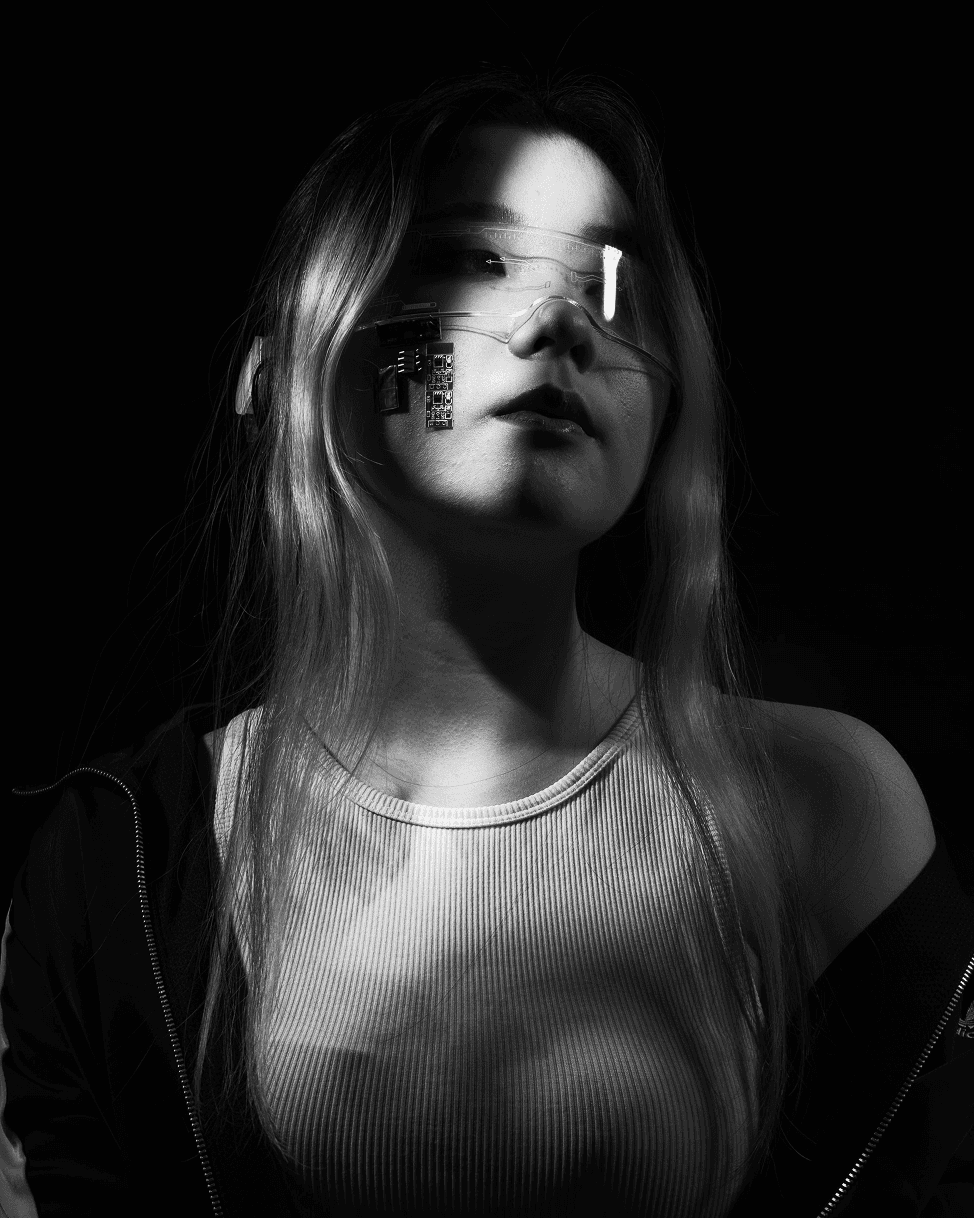
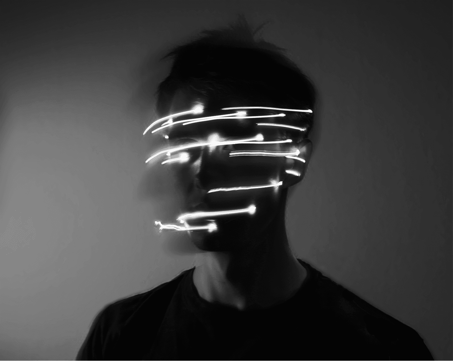
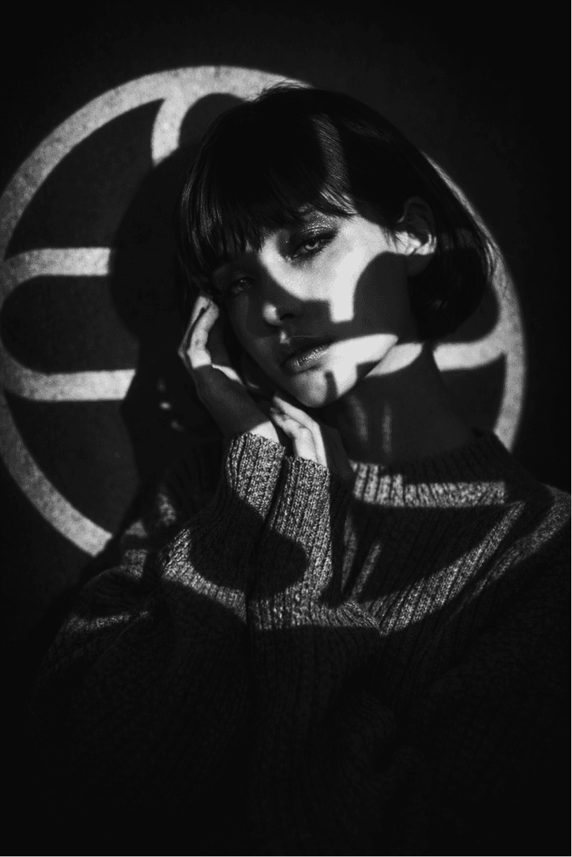
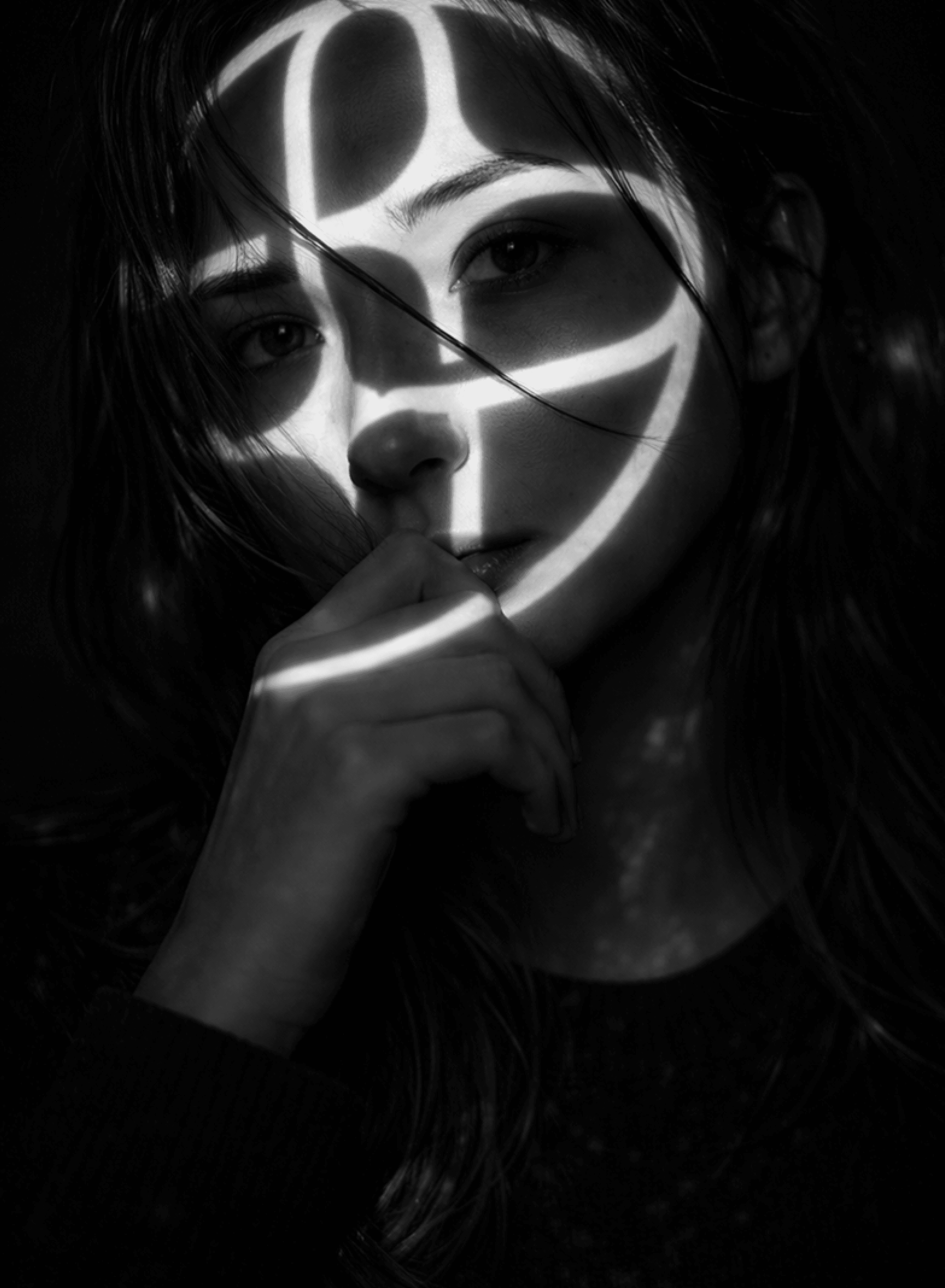
Meridian’s photography style is rooted in futurism, atmosphere, and digital abstraction. The visual language combines cinematic lighting, projections, motion blur, and glowing light trails to create imagery that feels immersive, modern, and experimental. Photography should feel emotionally driven yet minimal, using light as both an artistic and storytelling element. High-contrast monochrome tones, soft distortion, reflections, and projected graphics help create a mysterious and technologically advanced aesthetic, while clean compositions and atmospheric environments reinforce Meridian’s sleek and forward-thinking identity.

Illustration
Meridian’s illustration style is built around geometric abstraction, precision, and futuristic minimalism. Using structured lines, layered forms, grids, and spatial compositions, the illustrations create a visual language inspired by data systems, digital architecture, and technological movement. Circular paths, linear patterns, perspective shapes, and abstract diagrams are combined to represent concepts such as connectivity, intelligence, motion, and data visualization. The illustrations should remain clean, minimal, and highly structured, using monochrome palettes, fine strokes, and balanced spacing to maintain clarity and sophistication. Every composition is designed to feel analytical yet artistic — reinforcing Meridian’s modern, forward-thinking identity across digital interfaces, presentations, and product experiences.
Meridian
@meridianai
An agentic AI platform designed for deep research, intelligent reasoning, and autonomous execution.
Built to transform complex information into fast, actionable insight.
100 Following
10k Followers
meridian.ai
Follow